Without Typography, it’s only Words | documentation
TYPOGRAPHY COURSE / BACHELOR STUDIES


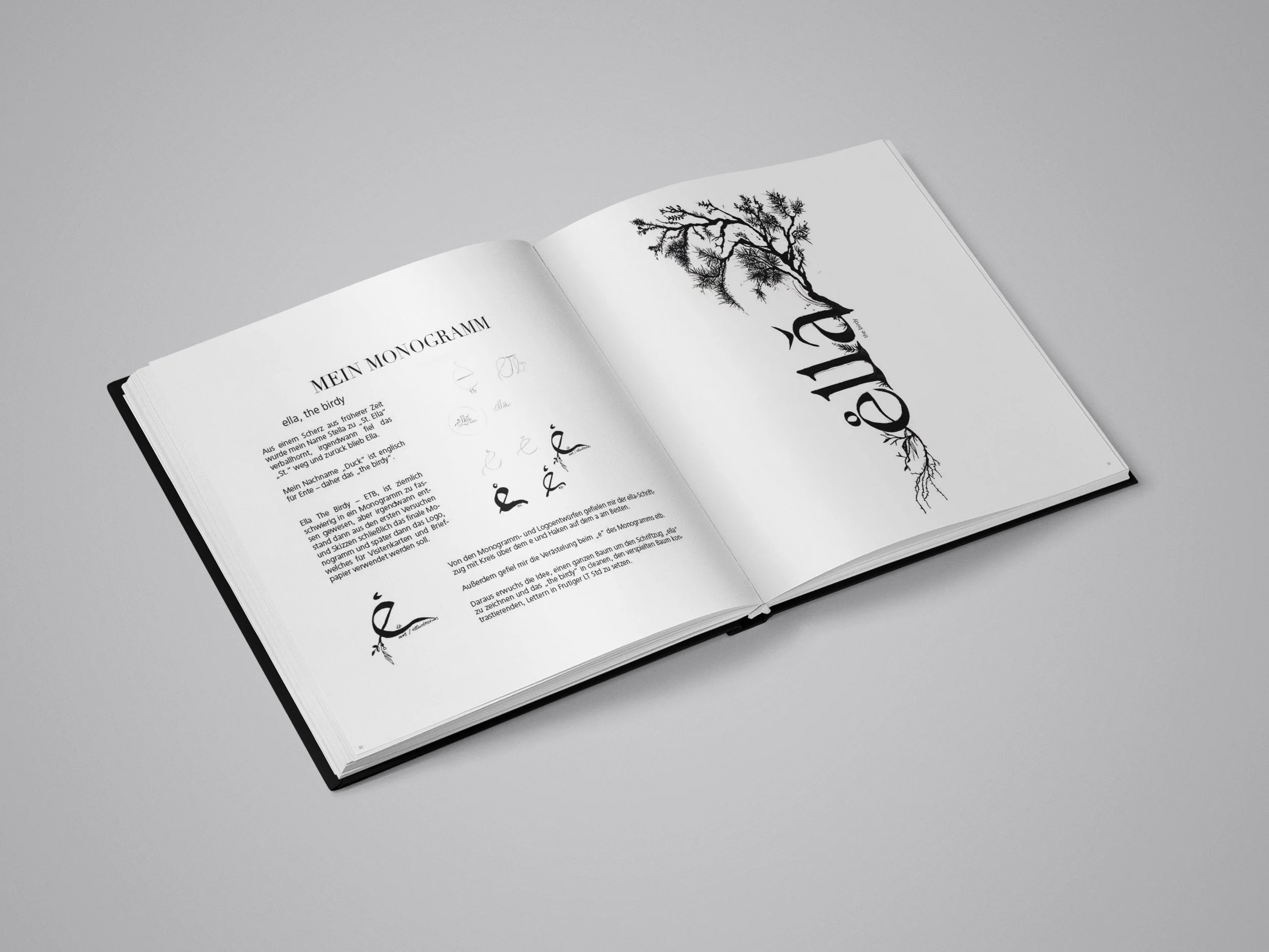
STORY:
This semester documentation, created during my typography course in 2018, emphasizes the power of high contrast and boldness through a minimalist black-and-white layout. The square format enhances the symmetry of the design, creating a clean, structured look that allows the content to shine. The use of black and white creates a striking visual contrast, guiding the reader's attention to the typography itself while maintaining clarity and balance. Each page focuses on typographic principles explored throughout the semester, with bold fonts and clear hierarchies making the information both engaging and easy to follow. The minimalist design is not just a stylistic choice but also a deliberate decision to highlight the elegance and impact of typography in its purest form. The layout carefully balances the space, ensuring the typographic elements stand out while maintaining an aesthetically pleasing flow. This project reflects my approach to typography as both a form of communication and an art, showcasing how powerful a simple, high-contrast design can be in emphasizing key content. The bold yet controlled nature of the layout captures the essence of the typographic exploration throughout the semester, presenting both the work and its concepts with clarity and visual impact.